
Surrey Langley SkyTrain
A collection of public-facing communication materials developed for the Surrey Langley SkyTrain project, supporting construction updates, community outreach, and wayfinding across multiple formats.
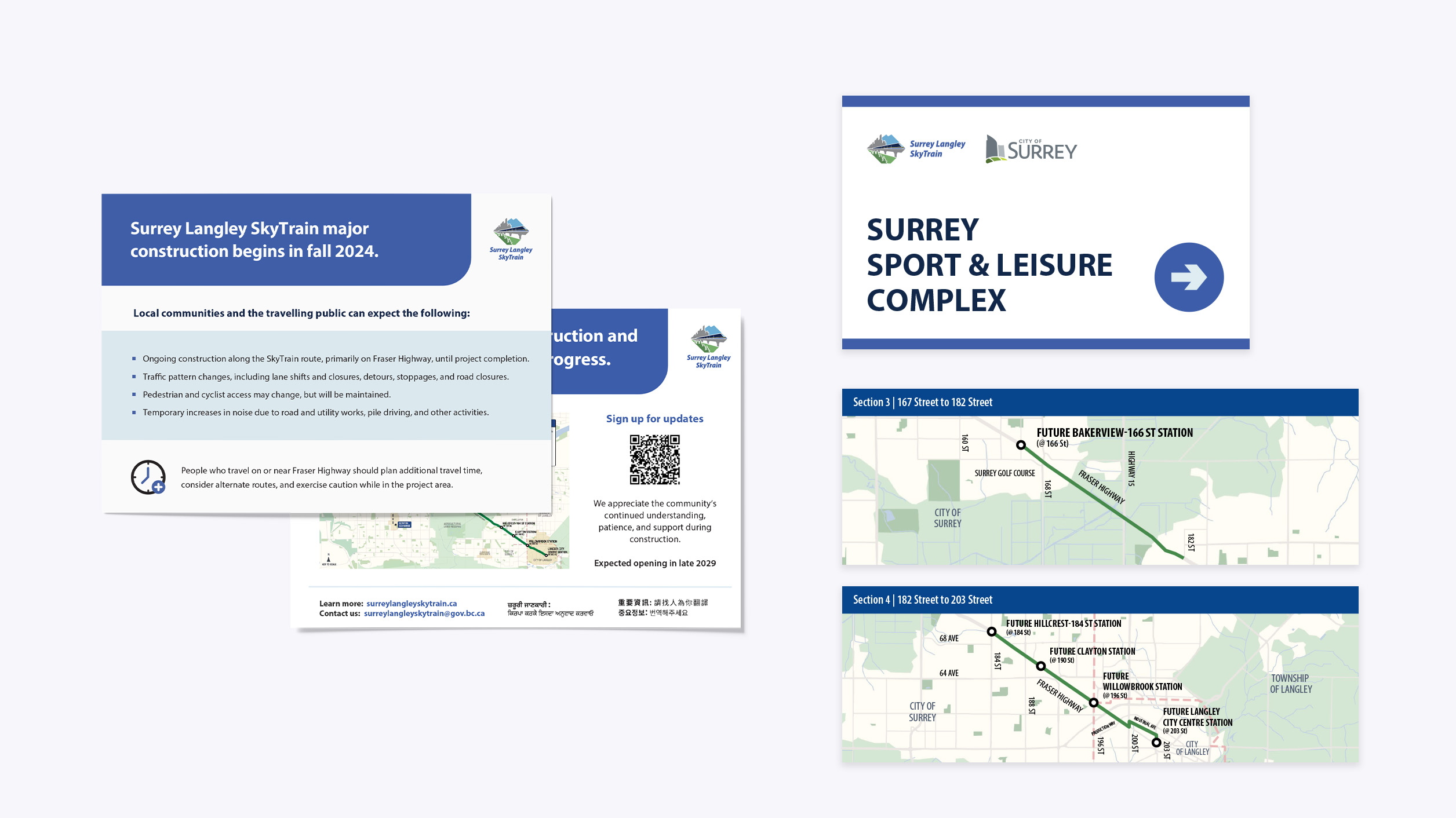
Project overview
Working within the established Surrey Langley SkyTrain brand system, I designed a range of communication materials to support ongoing construction and public outreach.
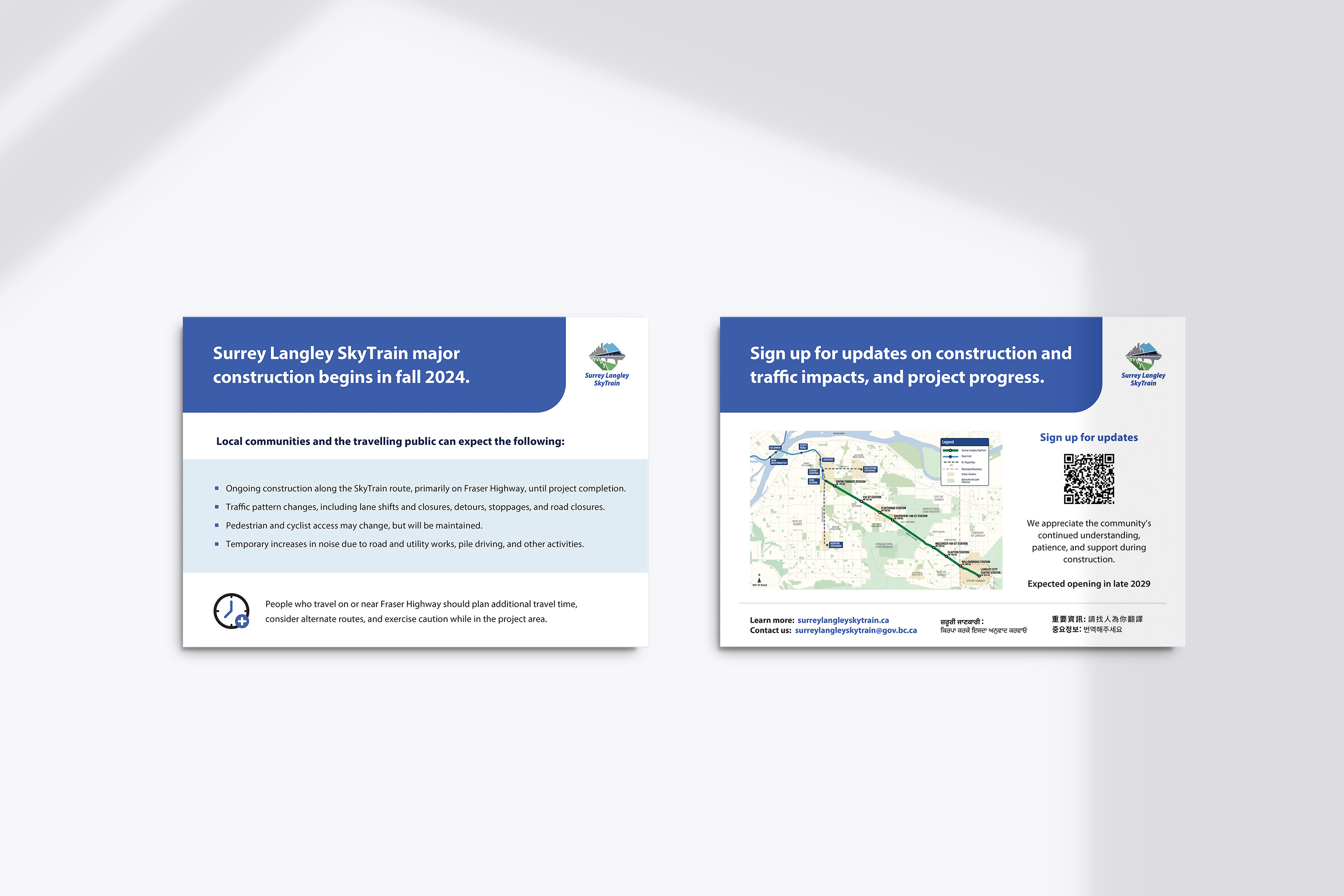
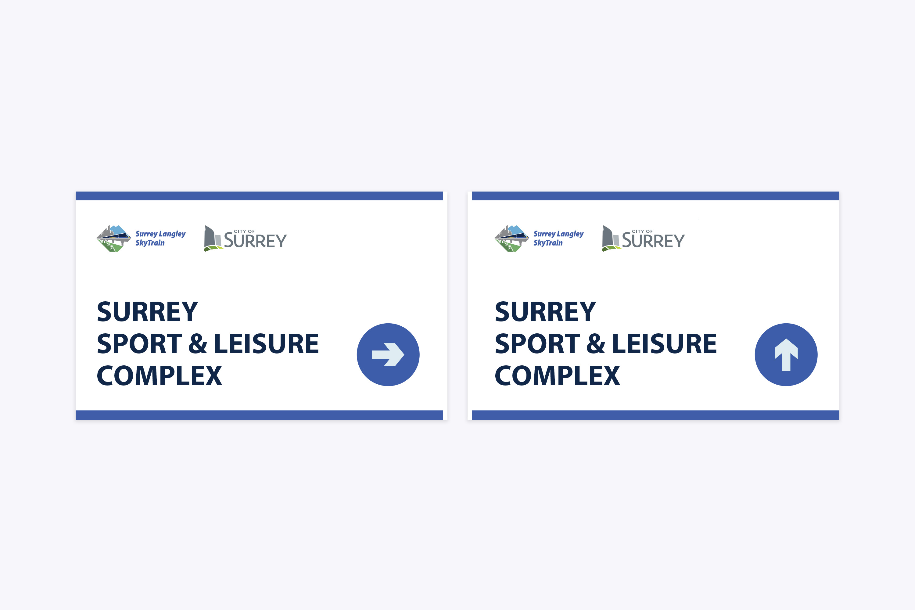
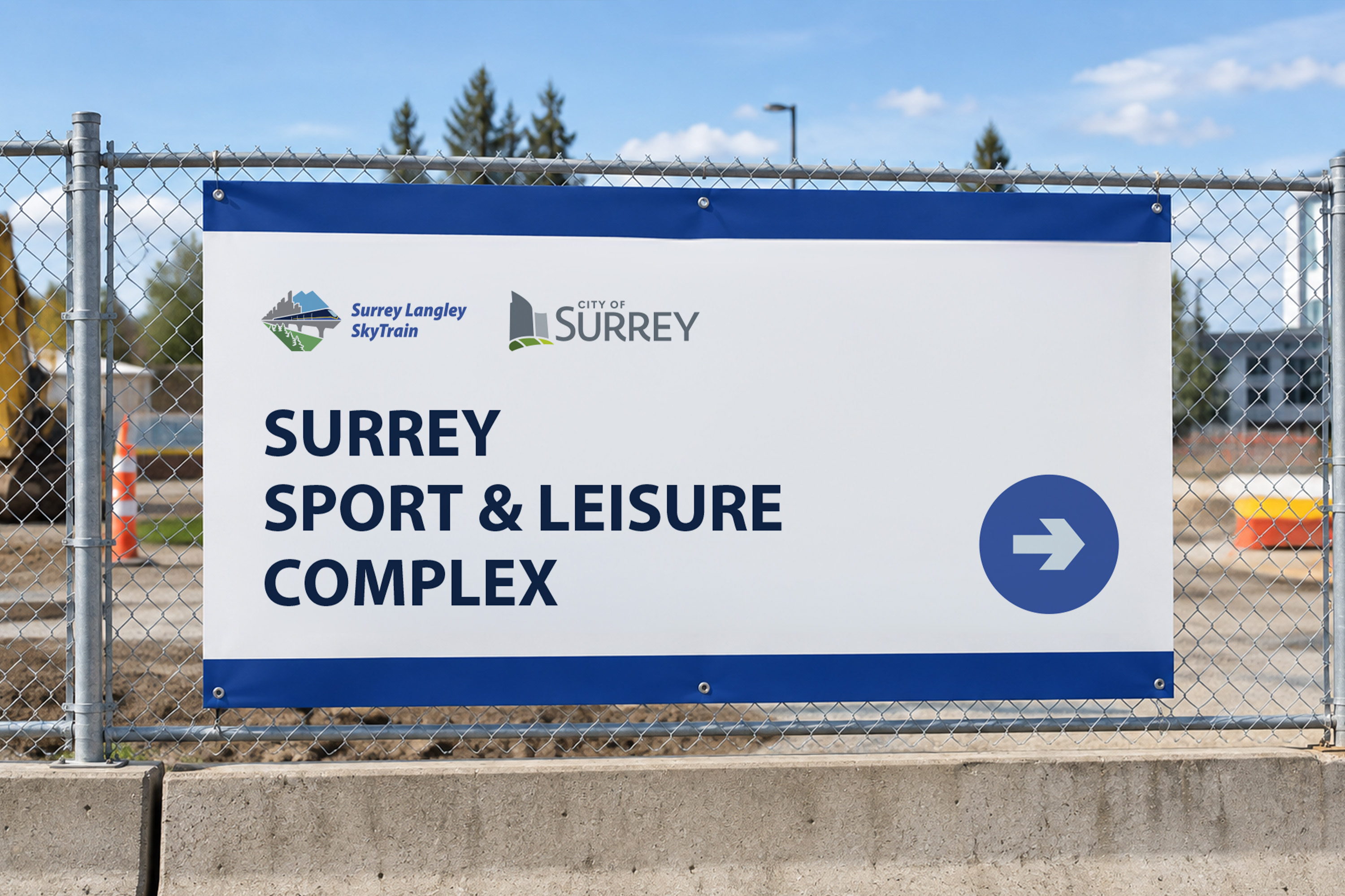
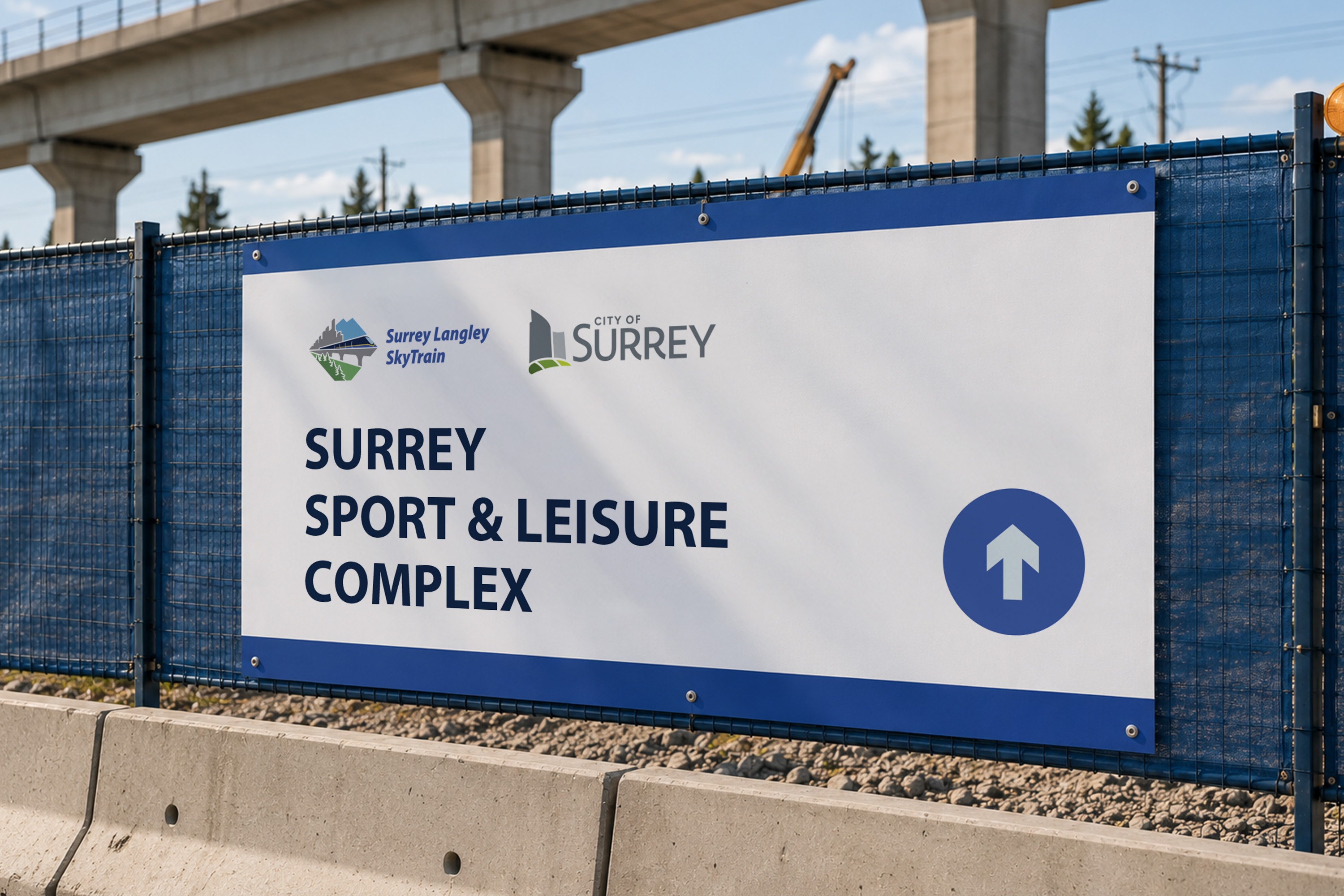
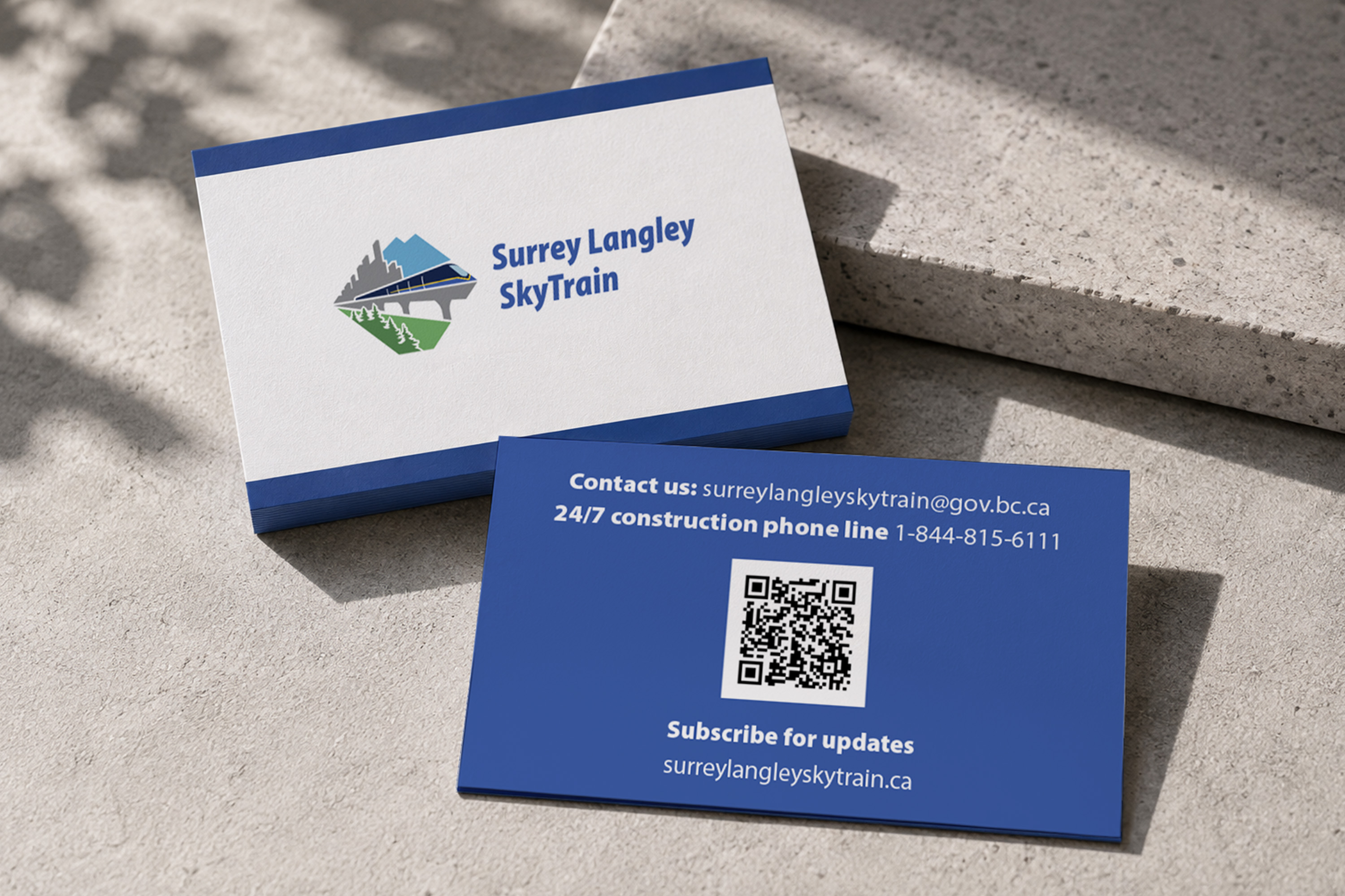
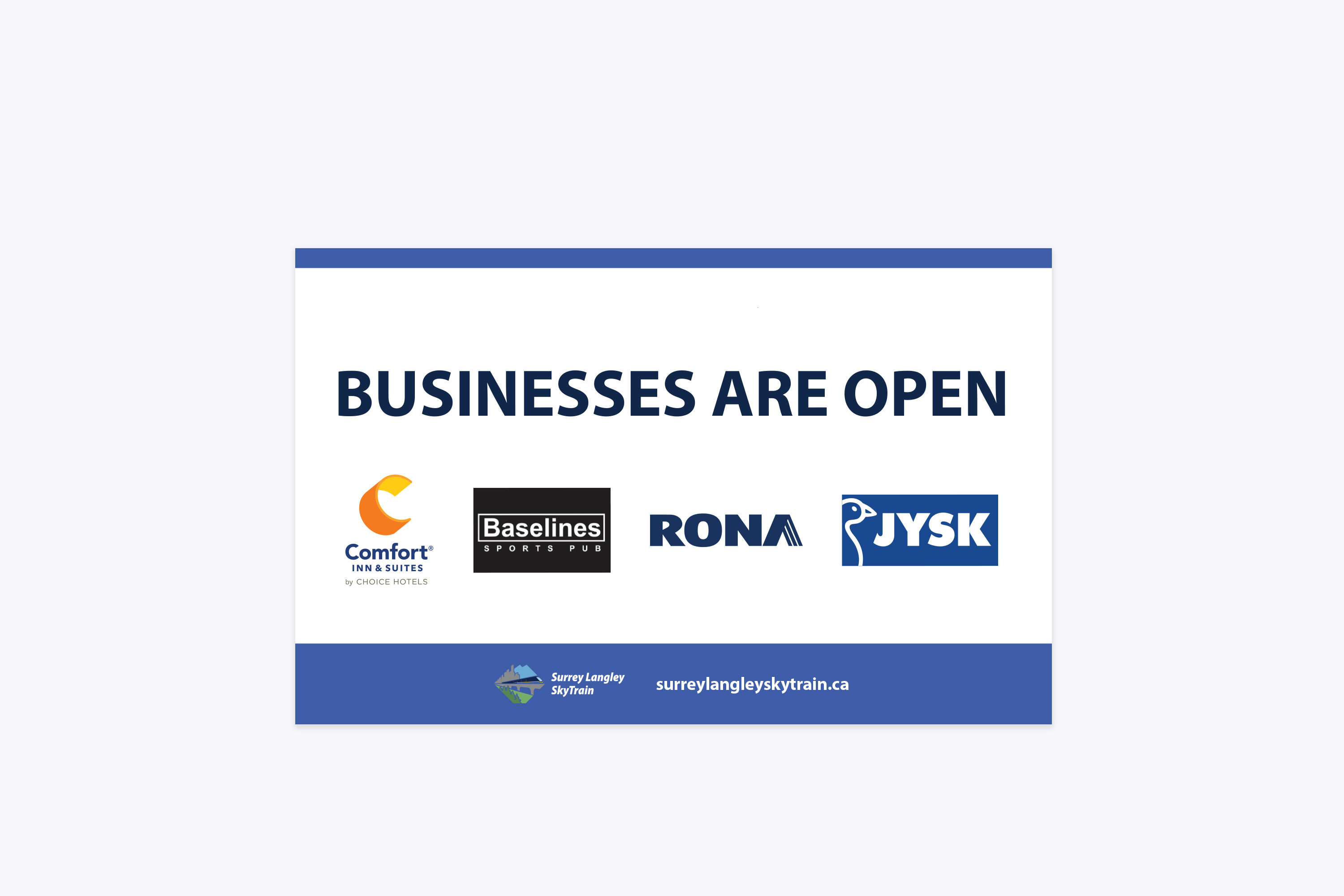
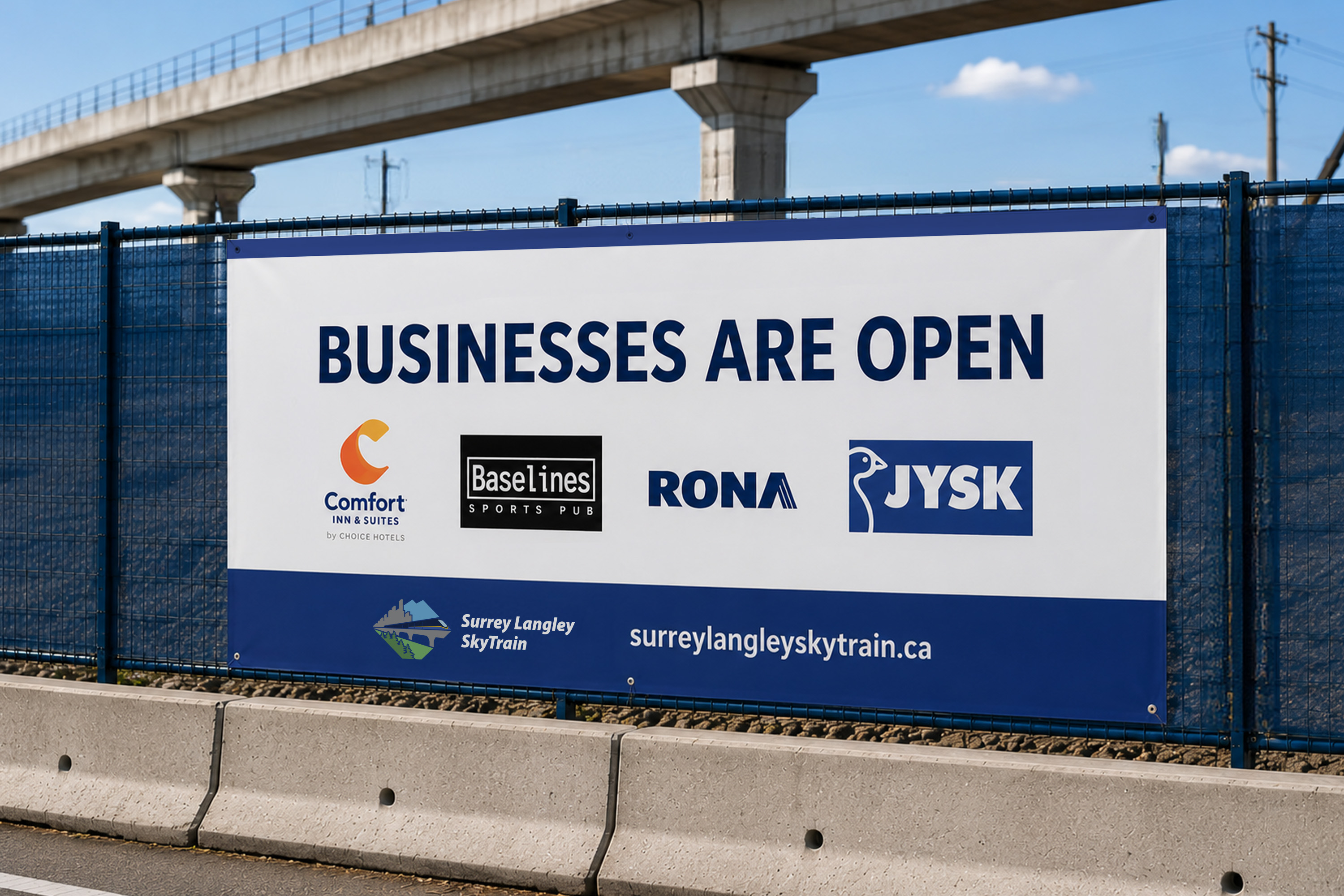
The work spanned postcards, construction advisories, wayfinding signage, and supporting collateral—each requiring clear information hierarchy and consistency across different formats and environments.
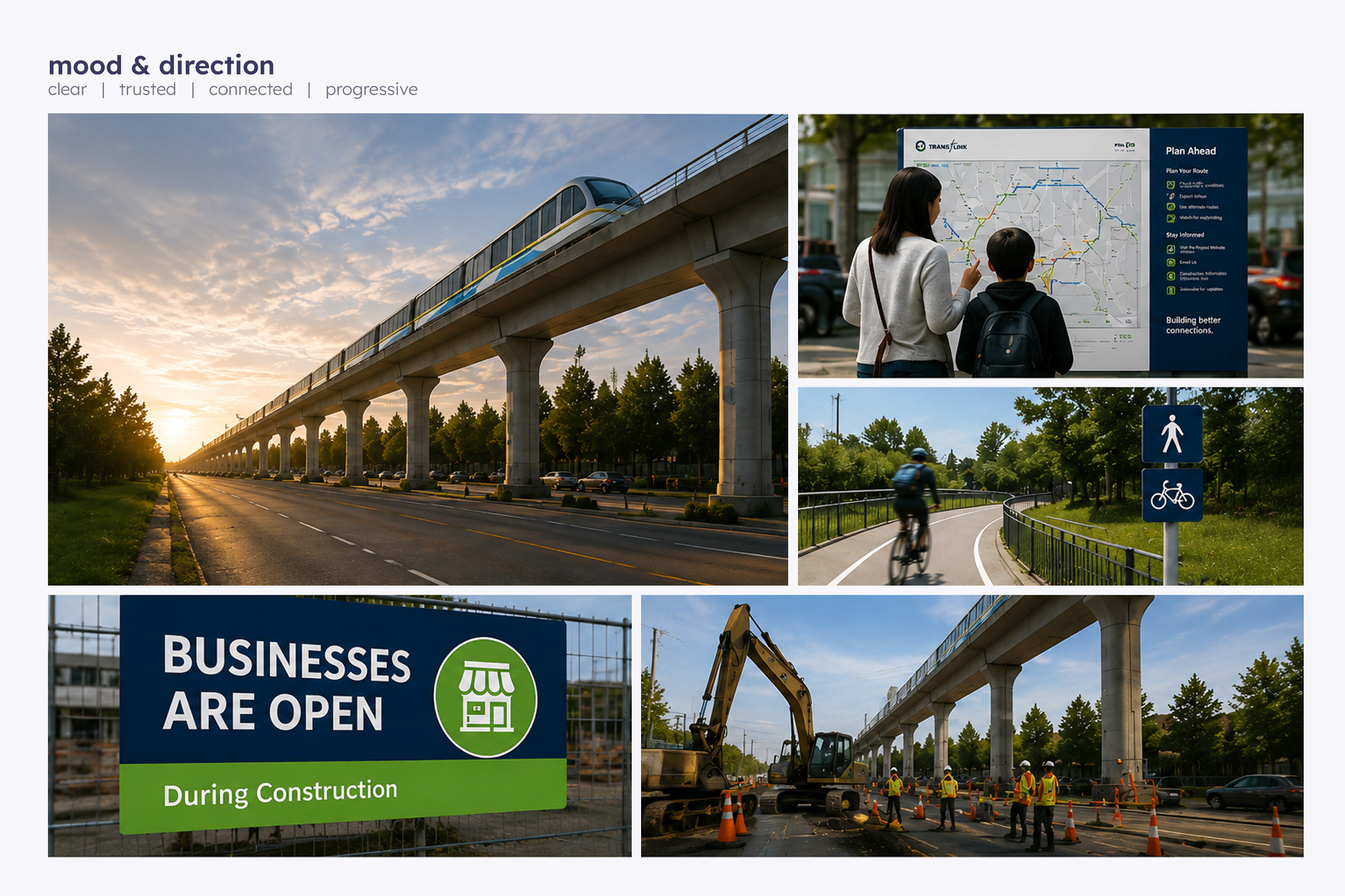
Approach
Clear, Consistent & Adaptable
The design approach focused on making complex public information clear, consistent, and adaptable across multiple communication formats.
Clear
Prioritize essential information through strong visual hierarchy.
Consistent
Maintain a cohesive visual language across formats and touchpoints.
Adaptable
Create flexible layouts for changing content and communication needs.
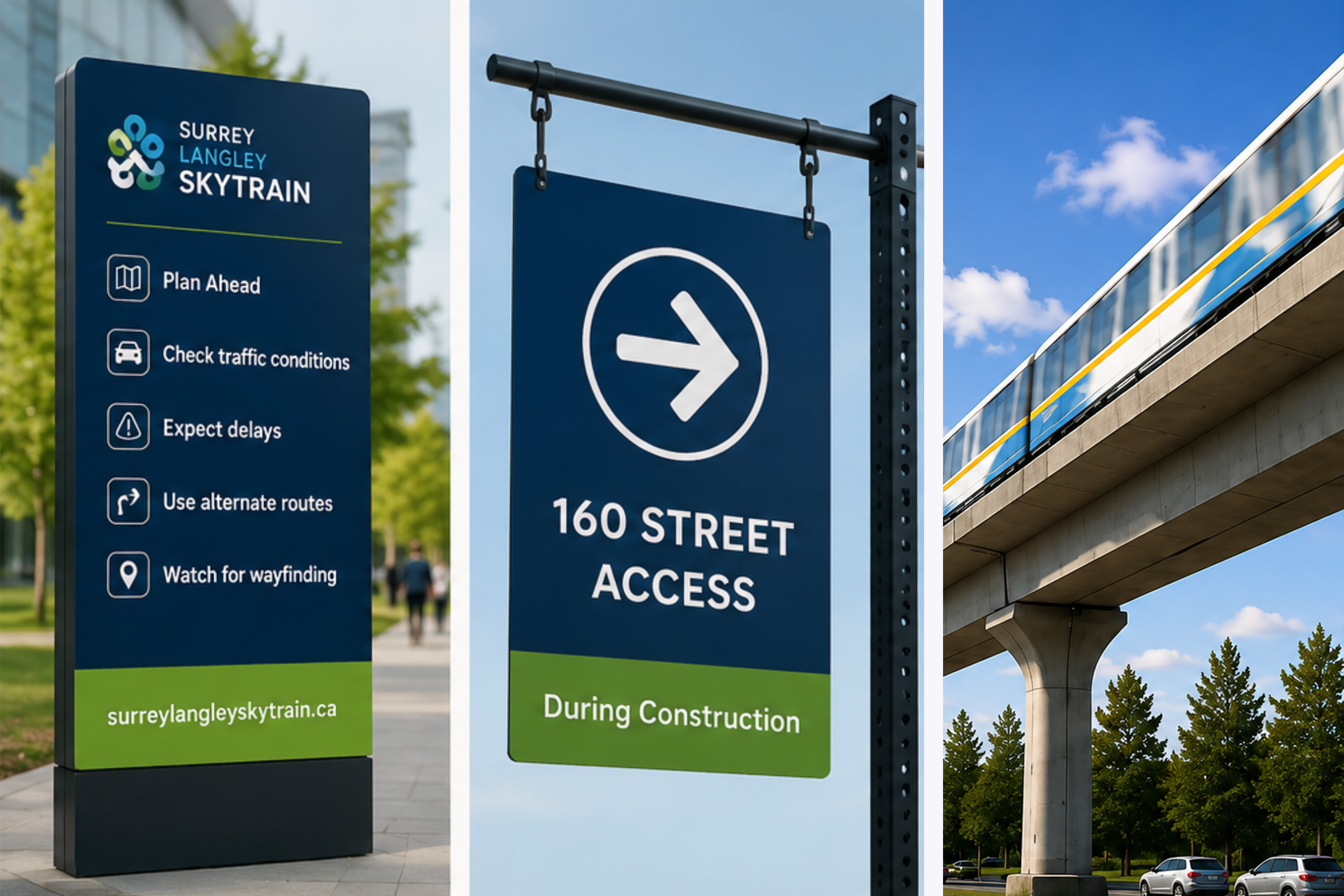
Execution
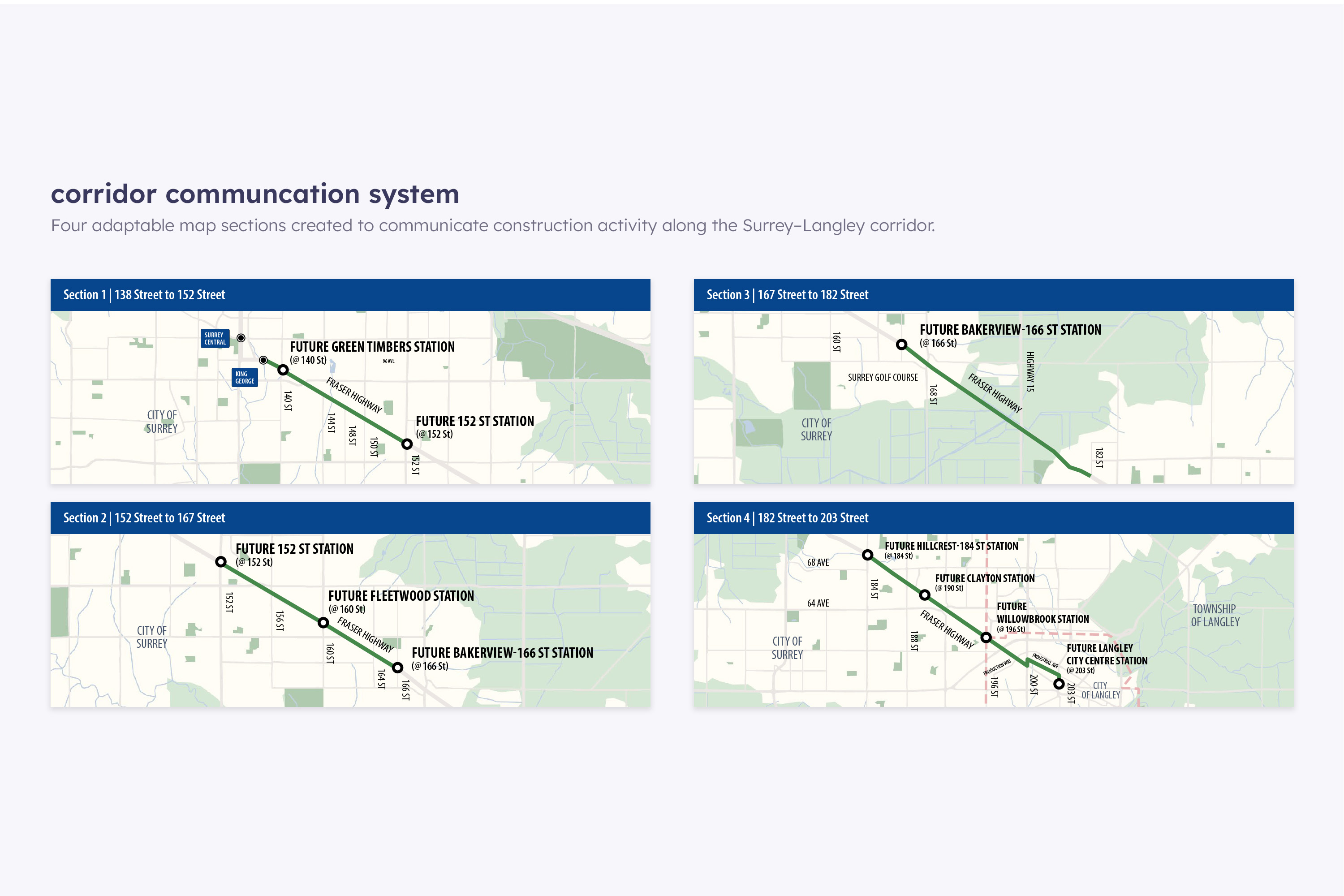
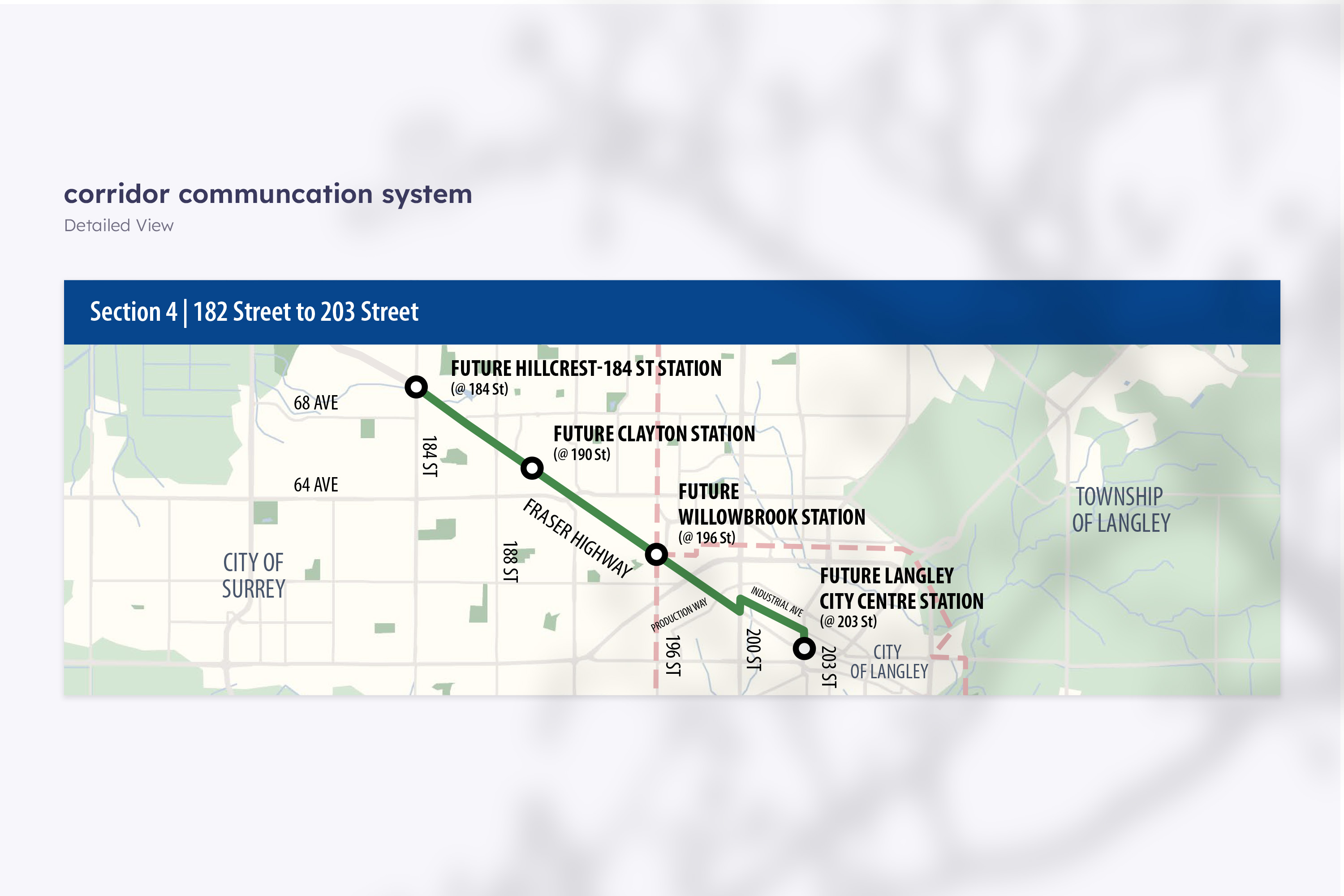
The materials were designed to make project information easy to navigate across both detailed and quick-glance formats. Consistent typography, layout systems, mapping elements, and brand standards helped maintain a cohesive visual language throughout the project.
Reusable layouts also supported recurring construction updates, allowing information to be adapted efficiently as project locations and details changed.
Challenge
Communicating ongoing construction information across multiple formats required a balance of clarity, consistency, and flexibility. Each piece needed to work within an established brand system while remaining easy to understand in different contexts, from detailed construction updates to quick-glance signage.
Outcome
A cohesive collection of public-facing materials that supported construction updates, community outreach, and wayfinding. Consistent visual hierarchy and adaptable layouts helped maintain a recognizable project presence across print and environmental applications.
Key Takeaways
This project strengthened my experience designing within an established brand system while adapting complex information across multiple touchpoints. It also reinforced the value of reusable layouts and clear information hierarchy when producing recurring, time-sensitive communications.
more projects
Let’s Skyrocket Your Next Project Together
contact me to discuss further about your project