
Sukh Brar Team Website Design
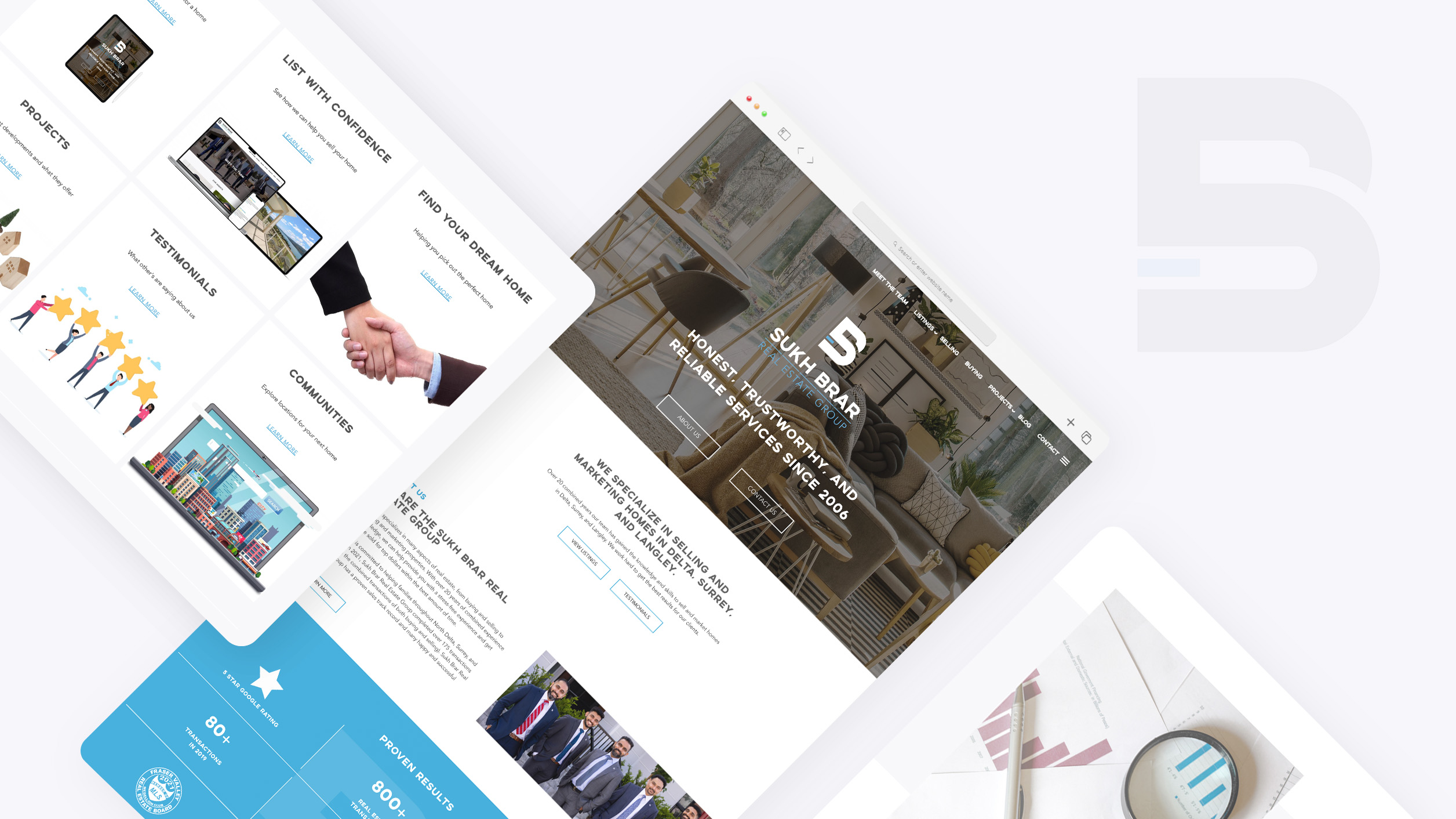
Sukh Brar Real Estate Group is one of the big real estate agencies located in Surrey, BC, that covers from resales to presales.
Project overview
The goal is to deliver a unique website UI that differentiates from other realtors to emphasize their professionalism and branding to stand out more and; therefore, grow their audience in a long term. Our secondary goal is to deliver a UI that satisfies both clients and designers. The team wanted to design at least six fully custom pages and implement specific fonts and the existing logo. I was the main designer of this project, mainly communicating with clients and delivering the designs based on their feedback.
execution
To fulfill the client's needs and deliver professional website UI at the same time, we first had a quick zoom call with the client and showed photos of various design types to find out their taste and also had a brief explanation to lead them to talk about specific elements to know they preference. In this process, we could able to narrow down the design into two types.
Specific Style Direction
During the style direction process, our team created the home page with two different style directions with detail like capped, bold, and dark accent style, or thin and soft but light and saturated accent. We also included a description on top of each style to make sure the client understand each style conveyed what feeling to the audience.
In this stage, we figured that the team wanted to mix both styles: clean interface with capped, bold but using their light saturated blue accent colour
proven numbers & rewards & testimonials
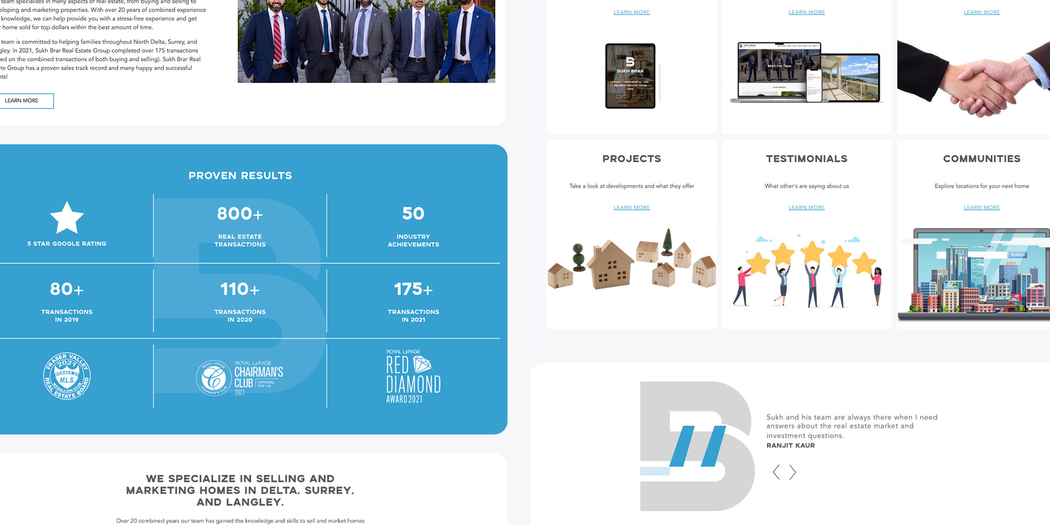
To differentiate the client from other realtors, we added a “Proven results” section in the middle of the home page and on the “meet the team” page. It has the actual numbers of yearly transactions and rewards, which will gain the trust of its potential customers and will get them more leads. As well, those proven numbers will bring an unconscious promise to value to potential customers.
Brand to stand out
To bring a meaningful and memorable brand, we strategically used their logo as a watermark and used muted colours for the rest to make accent colours stand out more; therefore, the audience can remember more of their brand's shape and colour.
First impression is important
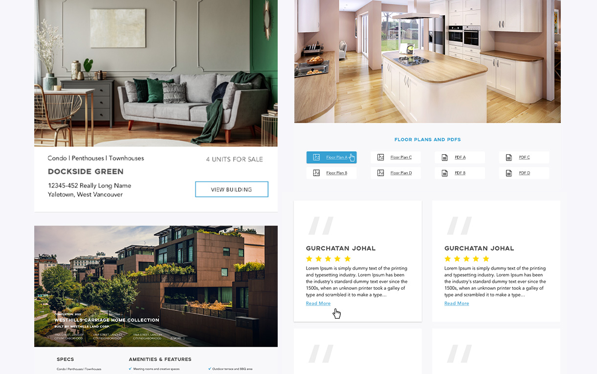
Since real estate is all about photos, we focused on designing a full-page background for the intro and large photo sections and cards in the overall design.
Results
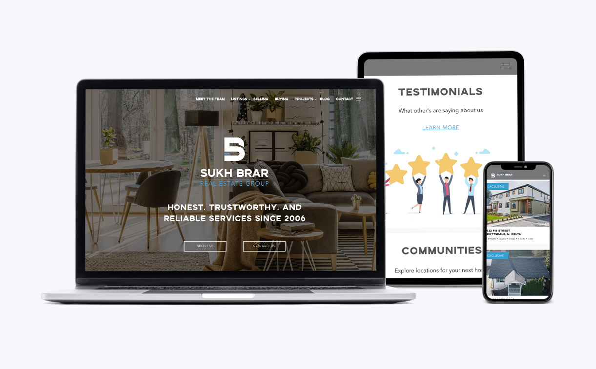
After the overall site design draft, the team was extremely happy with the result which lead to trust in our decisions. The rest process of fixing minor detail went smoothly in 2 weeks.
Key takeaways
Through this project, I learned a big lesson that it’s always good to let clients know what is really going on through each stage and what thoughts were melted in each detail although it takes some time to write accurate design explanations. I saw the client was satisfied that we were putting effort into their project and they could able to happy participate as a result. I believe this tiny change escalates the quality of the service.
more projects
Let’s Skyrocket Your Next Project Together
contact me to discuss further about your project